Category Archives: Maths

Boris Johnson’s massive maths mistake over Covid deaths is an embarrassment

This post is adapted from my Indy Voice article of the same title originally published on 02/03/23

Yesterday many of us woke up to read headlines about Matt Hancock having ignored scientific advice about protecting care homes in the early stages of the pandemic (though a spokesperson for the former health secretary has since said that the reports are “flat wrong”, and that the interpretation of the messages’ contents is categorically untrue).

The story arose from a cache of over 100,000 WhatsApp messages that had been leaked to the Daily Telegraph.

Buried in WhatsApp conversations between then-prime minister Boris Johnson, his scientific advisers and Dominic Cummings, is an exchange which is arguably even more worrying than this headline-grabbing story.

On 26 August 2020, Johnson asked the group:

“What is the mortality rate of Covid? I have just read somewhere that it has fallen to 0.04 per cent from 0.1 per cent.”

He goes on to calculate that with this “mortality rate” if everyone in the UK were to be infected this would lead to only 33,000 deaths. He suggests that since the UK had already suffered 41,000 deaths at that point, this might be why the death rate is coming down – because “Covid is starting to run out of potential victims”.

In fact, death rates were still coming down as a result of the earlier fall in the number of cases brought about by lockdown. Already though, by the time this conversation took place cases were rising again in the early stages of what would become a catastrophic second wave.

Based on his faulty maths, Johnson questioned “How can we possibly justify the continuing paralysis to control a disease that has a death rate of one in 2,000?”. He was suggesting that anti-Covid mitigations could be relaxed at perhaps the worst possible time. His whole argument was based on two fundamental misunderstandings.

His first mistake was a mathematical one. Johnson had seen the figure 0.04 in the Financial Times and interpreted it as a percentage. In fact it was a fraction – the number of people who were dying of Covid-19 divided by the number of people testing positive. This is known as the case fatality ratio (CFR).

At 0.04 (or 4 in 100), the CFR calculated by the Financial Times was 100 times larger than Johnson had suggested – it was actually four per cent, not 0.04 per cent as he believed.

The chief scientific adviser Patrick Vallance patiently explained this to Johnson: “It seems that the FT figure is 0.04 (ie four per cent, not 0.04 per cent)”. Johnson replied “Eh? So what is 0.04 if it is not a percentage?” at which point Dominic Cummings had to jump in and break it down into even simpler terms. Even then the messages show no acknowledgement from Johnson that he had understood.

The other mistake that Johnson made in his calculation was to confuse the case fatality ratio with the infection fatality ratio (IFR). The IFR is the number of people who die from Covid-19 as a proportion of those who get infected.

Though they may sound similar, there is a big difference between the CFR and the IFR. In the CFR we divide the number of Covid deaths by the number of people who test positive. However, in the IFR we divide by the number of infected people.

Early on in the pandemic, when testing was not readily available, the number of people who tested positive was much lower than the number of people who were actually infected with the disease. Because of this, the CFR overestimated the IFR.

By mixing up percentages and proportions, Johnson’s calculation actually underestimated what the figure should have been by a factor of 100. If he had had the CFR correct he would have come to a very different conclusion – that over 3 million people in the UK would die.

In reality, to do this calculation you need the IFR, not the CFR. With a 1 per cent IFR (closer to the true figure), the correct version of Johnson’s simplistic calculation would suggest that 660,000 people might have died in the UK if everyone became infected – 20 times more than Johnson’s mistaken numbers suggested.

It is almost unimaginable that the leader of the United Kingdom could allow his thinking to be informed by calculations which contained such rudimentary errors. Mistaking the CFR and the IFR would perhaps have been understandable in the early stages of the pandemic, but this conversation took place long after the first wave had subsided.

To have made this mistake over six months into the UK’s pandemic response is indicative of a leader who has failed to fully engage with even the most basic science required to make important decisions surrounding the pandemic. It perhaps explains Johnson’s reluctance to institute stronger mitigations in the autumn of 2020 as were called for by his own scientific advisors.

Even less forgivable is his mathematical mistake, which is indicative of his failure to engage in scientific thinking more generally. At a time when other country’s leaders were going on national television and defining important epidemiological concepts the masses, we endured a prime minister who was making basic mathematical errors the likes of which most 11-year-olds would not succumb to.

When it came to scientific literacy – such a crucial currency in the response to the pandemic – this incident suggests we suffered under the worst possible leader at the worst possible time.
Suella Braverman’s numbers on small boats are all wrong

This post is adapted from my Indy Voices article of the same title originally published on 13/03/23

Upon unveiling new plans to deter people from crossing the Channel in small boats, Suella Braverman claimed that 100 million people could already be on their way to seek asylum in the UK.

In her speech to the commons, the home secretary claimed: “There are 100 million people around the world who could qualify for protection under our current laws. Let’s be clear. They are coming here.”

An article she wrote the following day repeated the claim and went further suggesting that there were “likely billions more” eager to come to the UK if possible.

In reality, just 85,000 people have arrived in the UK in small boats across the Channel since 2018 – just 17,000 a year on average.

Even the relatively high 45,000 people who arrived in the UK last year to seek asylum by crossing the channel on small boats pales into comparison – at just 0.045 per cent of Braverman’s touted 100 million figure. In total, around 90,000 people applied for asylum in the UK in 2022.

To set the record straight on the numbers, of the 100 million people that the United Nations High Commissioner for Refugees estimates are displaced around the world, only around a quarter have actually left their home country.

Estimates vary, but around three-quarters of displaced people who do leave their own country remain in a neighbouring country. Surveys consistently demonstrate that the majority of refugees would like to return to their homes as soon as it is safe for them to do so.

Historically, we have relatively fewer asylum seekers applying to the UK, compared to our population size, than many of the EU nations. In 2021, there were around nine asylum applications per 10,000 people in the UK.

Across the rest of the EU, this figure was 14 applications per 10,000 residents, placing the UK below the average in 16th place. In 2022 the UK received 75,000 asylum applications. Germany received almost 250,000.

Despite these facts, the home secretary sees it to her advantage to overinflate the potential scale of the number of people arriving in the UK. She believes that the potential threat posed by this hypothetical deluge justifies legislation which, many believe, is in contravention of international law.

ADVERTISING

The huge numbers being bandied about are hard for us to get a handle on. Many people struggle to visualise the difference between thousands, millions and billions. Even if they know that a billion is a thousand times more than a million and a million is a thousand times more than a thousand, when numbers get really large they can go beyond the scale of things we are able to relate to. Everything just seems big.

One way to comprehend the difference is to think about time – a phenomenon which we experience both on very short and very long scales. A hundred thousand seconds is a little over a day. You can go 24 hours without eating no problem.

A million seconds is about 11.5 days. Not eating for that long would push most people to the limits of their willpower. A billion seconds is about 35 years. Fasting for half a lifetime is patently impossible. The scale of the problem changes significantly as the numbers ramp up.

Here’s another way of thinking about it. If I give you £1,000 a day it will take just 100 days for you to amass £100,000. In three years you’ll become a millionaire. To become a billionaire, however, will take 2740 years.

When we compare the 100 million displaced people in the world to the fewer than 100,000 people who claimed asylum in the UK last year, at less than 0.1 per cent the number of asylum seekers doesn’t seem so large.

When we start to place the figures in context, it seems possible that by overplaying the scale of the situation to the public – by bandying around figures of hundreds of millions or even billions – Braverman’s tactic runs the risk of backfiring, making the scale of current asylum applications look eminently manageable.

Even the 45,000 people who came to Britain to claim asylum via boats across the channel represent only around 0.07 per cent of the current population of the UK.

Even when placed in context though, we must be careful not to focus too heavily on the numbers which have grabbed the headlines. We must remember, at its heart, that this story is not about numbers. It is about people. Often desperate people fleeing the traumas of their past and hoping to build a better life for themselves.

By denying them the protections afforded under international law; by breaking the European convention on human rights, the UN convention on refugees and the universal declaration of human rights – all of which the UK was a founding member of – we are betraying the legacy that our country fought so hard to secure.

Why are we so proud of being ‘bad at maths’?

This post is adapted from my Indy Voices article of the same title originally published on 17/04/23

In front of an audience of students, teachers, education experts and business leaders, Rishi Sunak set out his plans to “transform our national approach to maths”.

Citing England’s “anti-maths mindset” the prime minister suggested: “We’ve got to start prizing numeracy for what it is – a key skill every bit as essential as reading.”

In an attempt to “not sit back and allow this cultural sense that it’s OK to be bad at maths” and to not “put our children at a disadvantage”, Sunak has commissioned an expert panel made up of mathematicians, education leaders and business representatives to figure out how to “fundamentally change our education system so it gives our young people the knowledge and skills they need”.

Plans to investigate how we can tackle issues around numeracy in England are laudable. The PM’s assertions that higher attainment in mathematics will “help young people in their careers and grow the economy” are not wrong. It is an uncomfortable fact that England consistently scores poorly when compared to other OECD nations for adult numeracy.

Lower numeracy is associated with poorer financial wellbeing for individuals. At the population-level, low-levels of maths skills could be costing the economy billions.

It is also true that there is a much greater stigma attached to illiteracy than there is to innumeracy. You don’t hear people boasting of not being able to read in the same way that people will proudly assert how poor they are at mathematics.

In part, this is because it is much harder to function day-to-day with poor literacy than it is with poor numeracy. But poor numeracy can have hidden and wide-ranging impacts with, for example, one in four people surveyed recently suggesting they had been put off applying for a job because it involved numbers or data.

However, it is not clear that Sunak’s previously announced plan to enforce compulsory mathematics until the age of 18 will tackle these problems effectively. In reality we need a more holistic approach which tackles the stigmas surrounding the study of quantitative subjects throughout primary and secondary education.

By the age of 16, the battle for the prestige of mathematics has already been lost for many of our young people. It is possible that enforcing further mathematical study on these disaffected young adults will make the problem worse, not better.

The blanket policy of compulsory maths for everyone in education up to the age of 18 has the potential to backfire, putting pupils off post-16 education completely.

Instead, we need to work to change attitudes towards numeracy from the very earliest stages of our children’s mathematical education. Hands-on mathematics discovery centres, such as the recently launched MathsCity in Leeds, are one way in which we can hope to build a fun and engaging image of mathematics for our children from an early age.

Illustrating the importance and relevance of maths and the opportunities it can open up as part of the curriculum – something that is currently being attempted by the relatively new “core maths” qualification – might also help to improve attitudes towards mathematics.

Perhaps the biggest threat to the quality of maths education in England today is the long-term shortfall in the number of maths teachers in post. Despite significantly reducing their target for the recruitment of maths teachers, the government again failed to hit even this diminished objective in 2022.

Almost half of all secondary schools are already using non-specialist teachers for maths lessons.

How does the prime minister expect to expand our mathematics education opportunities when we can’t even fill the posts required for our current provision?

Given that the current industrial action being waged by teachers has been triggered by the erosion of teachers’ pay and conditions, and with no resolution to the dispute on the horizon, it is unclear how the government will be able to tackle even the current deficit in teacher numbers let alone recruit enough to deliver an expanded curriculum.

Whilst the idea of improved numeracy for all is an important one – and one which if achieved would significantly benefit both the people of the UK as individuals and the nation as a whole – it is not clear that there is a plan in place to deliver this effectively.

Presumably, Sunak’s expert-led review will be charged with advancing just such a plan. But without the teachers required to cope even with our current educational demands and no satisfactory resolution to strike action on the horizon, it remains to be seen how we will possibly implement any plan to improve numeracy that requires an expansion in our ability to deliver relevant, engaging and inspiring maths lessons.

How do we know health screening programmes work?

This post is adapted from my Conversation article of the same title originally published on 30/07/23

The UK is set to roll out a national lung cancer screening programme for people aged 55 to 74 with a history of smoking. The idea is to catch lung cancer at an early stage when it is more treatable.

Quoting NHS England data, the health secretary, Steve Barclay, said that if lung cancer is caught at an early stage, “patients are nearly 20 times more likely to get at least another five years to spend with their families”.

Five-year survival rates are often quoted as key measures of cancer treatment success. Barclay’s figure is no doubt correct, but is it the right statistic to use to justify the screening programme?

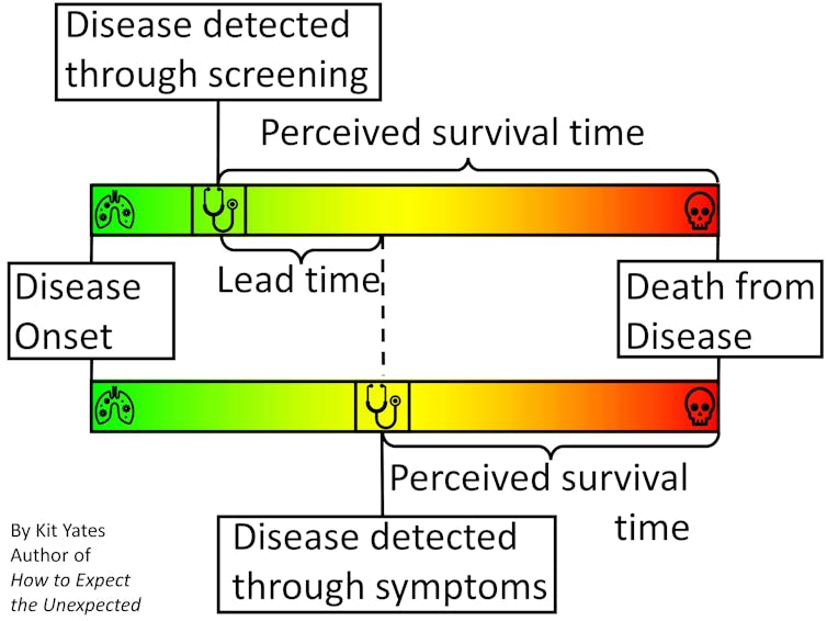
Time-limited survival rates (typically given as five-, ten- and 20-year) can improve because cancers caught earlier are easier to treat, but also because patients identified at an earlier stage of the disease would live longer, with or without treatment, than those identified later. The latter is known as “lead-time bias”, and can mean that statistics like five-year survival rates paint a misleading picture of how effective a screening programme really is.

A graphic to illustrate the impact of lead-time bias on the perceived survival length of a disease detected with screening v symptoms.
Lead-time bias can appear to make a treatment more effective than it actually is, if the perceived post-diagnosis survival time increases while the course of disease progression is unaffected. Kit Yates

My new book, How to Expect the Unexpected, tackles issues exactly like this one, in which subtleties of statistics can give a misleading impression, causing us to make incorrect inferences and hence bad decisions. We need to be aware of such nuance so we can identify it when it confronts us, and so we can begin to reason our way beyond it.

To illustrate the effect of lead-time bias more concretely, consider a scenario in which we are interested in “diagnosing” people with grey hair. Without a screening programme, greyness may not be spotted until enough grey hairs have sprouted to be visible without close inspection. With careful regular “screening”, greyness may be diagnosed within a few days of the first grey hairs appearing.

People who obsessively check for grey hairs (“screen” for them) will, on average, find them earlier in their life. This means, on average, they will live longer “post-diagnosis” than people who find their greyness later in life. They will also tend to have higher five-year survival rates.

But treatments for grey hair do nothing to extend life expectancy, so it clearly isn’t early treatment that is extending the post-diagnosis life of the screened patients. Rather, it’s simply the fact their condition was diagnosed earlier.

To give another, more serious example, Huntington’s disease is a genetic condition that doesn’t manifest itself symptomatically until around the age of 45. People with Huntington’s might go on to live until they are 65, giving them a post-diagnosis life expectancy of about 20 years.

However, Huntington’s is diagnosable through a simple genetic test. If everyone was screened for genetic diseases at the age of 20, say, then those with Huntington’s might expect to live another 45 years. Despite their post-diagnosis life expectancy being longer, the early diagnosis has done nothing to alter their life expectancy.

Overdiagnosis

Screening can also lead to the phenomenon of overdiagnosis.

Although more cancers are detected through screening, many of these cancers are so small or slow-growing that they would never be a threat to a patient’s health – causing no problems if left undetected. Still, the C-word induces such mortal fear in most people that many will, often on medical advice, undergo painful treatment or invasive surgery unnecessarily.

The detection of these non-threatening cancers also serves to improve post-diagnosis survival rates when, in fact, not finding them would have made no difference to the patients’ lives.

So, what statistics should we be using to measure the effectiveness of a screening programme? How can we demonstrate that screening programmes combined with treatment are genuinely effective at prolonging lives?

The answer is to look at mortality rates (the proportion of people who die from the disease) in a randomised controlled trial. For example, the National Lung Screening Trial (NLST) found that in heavy smokers, screening with low-dose CT scans (and subsequent treatment) reduced deaths from lung cancer by 15% to 20%, compared with those not screened.

So, while screening for some diseases is effective, the reductions in deaths are typically small because the chances of a person dying from any particular disease are small. Even the roughly 15% reduction in the relative risk of dying from lung cancer seen in the heavy smoking patients in the NLST trial only accounts for a 0.3 percentage point reduction in the absolute risk (1.8% in the screened group, down from 2.1% in the control group).

For non-smokers, who are at lower risk of getting lung cancer, the drop in absolute risk may be even smaller, representing fewer lives saved. This explains why the UK lung cancer screening programme is targeting older people with a history of smoking – people who are at the highest risk of the disease – in order to achieve the greatest overall benefits. So, if you are or have ever been a smoker and are aged 55 to 74, please take advantage of the new screening programme – it could save your life.

But while there do seem to be some real advantages to lung cancer screening, describing the impact of screening using five-year survival rates, as the health secretary and his ministers have done, tends to exaggerate the benefits.

If we really want to understand the truth about what the future will hold for screened patients, then we need to be aware of potential sources of bias and remove them where we can.

The hidden dangers of two-party politics

This post is adapted from my Indy Voices article of the same title originally published on 26/01/22

With local elections upon us, many voters feel like they are faced with the same old tired choice between the two major political parties – Labour and the Conservatives.

Despite the existence of third candidates, election leaflets come through the door telling us “Lib Dems can’t win here” – effectively arguing the case for a straight fight between the two major parties in British politics. But, as we look forwards to the general election next year, there are sound mathematical reasons why two parties battling it out – a duel so to speak – is not good for democracy.

In a two-horse race, declines in popularity for one candidate are equivalent to gains in popularity for the other. If it is harder to boost one’s own image than it is to denigrate the other party, then the incentive is for the parties to batter each other with negative advertising, leaving the electorate to choose between a rock and a hard place. The introduction of a genuinely electable third party can change the campaigning dynamics from a straight duel to a “truel” – a battle between three parties.

Truels are a popular trope in the cinema, having been used to resolve plot issues in at least three Quentin Tarantino movies alone. Probably the most well-known example, though, features in one of the most famous movie scenes of all time: towards the climax of The Good, the Bad and the Ugly, the three eponymous characters stand in a triangle on the perimeter of a circular plaza each with hands hovering around their waists ready to draw. I won’t spoil the ending.

As I explore in my new book, How to Expect the Unexpected, truels can have strange and unexpected outcomes if the players’ strengths differ markedly. The strongest candidates may tend to focus their efforts on each other as the greatest threat to one another, sometimes leaving the weaker candidate with the best chance of winning.

A favourable strategy for weaker participants in a multiplayer competitive game – namely staying in the background while the best fighters duel it out – has been arrived at naturally over and over again in the animal kingdom. While two of the most impressive specimens fight it out, killing or injuring each other, subordinate males can nip in and mate with the female.

So well established is this practice across the animal kingdom that it has its own name. Kleptogamy is derived from the Greek words klepto, meaning “to steal” and gamos, meaning “marriage” or more literally “fertilisation”. The evolutionary game theorist, John Maynard-Smith – who came up with the theoretical idea of kleptogamy – preferred to call it the “sneaky f***er” strategy.

Returning to politics, in the run-up to the June 2009 Virginia Democratic gubernatorial primaries in the US, state senator Creigh Deeds was floundering. In one January poll he registered just 11 per cent support.

Over the next four months he only polled higher than 22 per cent once, as the other two candidates, Terry McAuliffe and Brian Moran, swapped the polling lead between themselves. Deeds’ fundraising campaign was also stuttering. In the first quarter of 2009 – a crucial period ahead of the election, he had raised just $600,000 compared to Moran’s $800,000 and McAuliffe’s $4.2 million. But in mid-May the game suddenly changed.

The candidates began to plough much of their remaining resources into negative advertising. Moran went hard at his main rival McAuliffe, criticising his record as a businessman. McAuliffe responded to his biggest threat Moran with his own ad, defending his record and accusing Moran of “trying to divide Democrats”. Moran hit out again, criticising McAuliffe’s campaign against incumbent president, Barack Obama, in the Democratic primaries preceding the 2008 election. Moran hoped that this would diminish McAuliffe’s standing in the eyes of the state’s crucial African American voters.

All the while, as the top two candidates chipped away at each other’s reputations, unassuming underdog, Creigh Deeds, was planting seeds of positivity with his self-promoting advertising campaign. When the Washington Post came out and endorsed Deeds in late May, many undecided voters recognised him as a reasonable alternative to the two former frontrunners.

Deeds’ popularity in the polls shot up and by early June he was polling at over 40 per cent. Each of the formerly stronger rivals seemed to have managed to convince Virginian voters that the other was not electable. In elections on 8 June Deeds won just under 50 per cent of the vote to McAuliffe’s 26 per cent and Moran’s 24 per cent – a landslide for the weakest candidate.

The assumption of a two-party system does the electorate a disservice. Our democracy would be healthier if genuine multiparty politics were a reality, keeping all the parties honest and disincentivising negative advertising.

Different voting systems, such as the proportional representation or the alternative vote, favoured by other countries, might be a way to achieve this. They have the advantage that no vote is wasted – people feel free to vote for their preferred candidate rather than the candidate who is most likely to beat the only viable alternative.

Until the UK arrives at a system that incentivises genuinely multiparty politics, we will be stuck choosing between the red devil and the deep blue sea.

Why you’ve probably been using sunscreen all wrong your whole life

This post is adapted from my Indy Voices article of the same title originally published on 06/07/23

Are you a 50, a 30, a 15 or a “chance it in the name of a tan” oil lover? We all identify with at least one of these, but do you really know what SPF means – or how to use it?

Most of us don’t, actually. And as a mathematician with two redheads in their immediate family, I know better than most how vital it can be to protect yourself from the sun’s rays; particularly now, when the UK is experiencing some of the hottest weather this island has seen since records began.

The Met Office has issued a heat “health alert” for this weekend, with temperatures expected to reach at least 30C.

And we’ve just lived through the hottest June on record – warmer even than the June which kicked off the notoriously stifling summer of 1976. In fact, the top four hottest summers on record in the UK have occurred within the last 20 years, with the summer of ’76 only scraping in at number five. Two of the top four occurred within the last five years (2018 and 2022).

So, to state the obvious: with this climate crisis-induced trend looking likely to continue, it’s important that we know how to look after ourselves. But the less obvious issue is that it isn’t always easy to know which suncream you should use, or how much, particularly when it comes to things like SPF numbers. As I discovered when writing my new book, How to Expect the Unexpected, many people aren’t aware of what constitutes appropriate protection and how to use it.

Here’s what you might not realise when you’re slathering on suncream: of the two types of ultraviolet radiation that reach the earth’s surface – UVA and UVB – UVB plays the most significant role in causing sunburn and skin cancers. The higher the SPF (sun protection factor) you use, the more damaging UVB radiation is blocked, but the relationship between the number on the bottle is not directly proportional to the amount of radiation screened out.

Factor 50, for example, is not twice as effective at blocking UVB radiation as factor 25. Factor 30 does not block three times as much UVB radiation as factor 10.

In fact (still with me? good), when applied correctly, factor 10 blocks out… 90 per cent of all UVB radiation. Factor 30 blocks out just over 97 per cent – and factor 50 blocks out 98 per cent.

That means that the higher you go, the smaller the level of increased protection you are afforded. The increase in SPF from 10 to 30 gains you more than 7 per cent more protection. But the increase by the same numerical margin – from 30 to 50 – gains you less than 1 per cent extra sun screening effectiveness.

Factor 30 is usually the baseline recommended SPF by dermatologists. Lower than that and the degree of protection afforded starts to drop off quickly.

The way SPFs are often explained is by talking about the increase in exposure times different factors allow. If your skin would burn when subjected to 10 minutes of exposure without any protection, then the idea is that SPF 10 would extend that time by a factor of 10 to 100 minutes. SPF 50 would extend it to 500 minutes.

The underlying maths is that you can find the total UVB radiation exposure by multiplying the exposure time and the intensity of radiation experienced. When you apply SPF 50, the duration of time you can theoretically spend in the sun without getting burned increases by a factor of 50 (hence the reason it is called a sun protection factor).

If the total exposure is to be the same, to compensate for this increased time, the intensity of radiation must decrease by the same factor – 50. So, factor 50 lets only 1/50 (or 2 per cent) of the UVB radiation through, which is where the figure of 98 per cent screening effectiveness comes from for factor 50. Similarly, factor 10 lets only 1/10 of the radiation though, blocking 9/10 or 90 per cent.

If the maths goes over your head, then focus on this bit: Most dermatologists would recommend reapplying sunscreen every two hours, since protection can diminish over time as it breaks down, dries out or is rubbed off your skin.

By talking about the link between SPF and extended duration of exposure (the idea that factor 10 allows you to stay out 10 times as long) rather than screening efficiency, the traditional explanation of SPF can be baffling and misleading.

We forget that effectiveness diminishes over time as the sunscreen wears off. Talking only about SPF and not the proportion of UVB rays screened out can cause us to gain a false sense of security about how long we can stay out in the sun safely.

It’s also worth remembering that the SPF only refers to protection against UVB rays, which cause most skin cancers and sunburn. It does not grant protection against the deeper-penetrating UVA rays, which are largely responsible for premature skin ageing – but also cause some sorts of skin cancers and contribute to sunburn.

So: enjoy those outdoor parties and BBQs that we so rarely get the opportunity for in the UK. Take advantage of the opportunity to pursue the sorts of outdoor activities that our inclement winter weather so often deprives us of. But trust me on the sunscreen: wear at least factor 30, and reapply every two hours. You’ll thank me later.

What your name really means and how it can affect your life

This post is adapted from my Indy Voices article of the same title originally published on 17/07/23

What do these three people have in common? Usain Bolt, the world’s fastest man, Margaret Court, the former world-number-one tennis player, and Thomas Crapper, the plumber and toilet designer who, contrary to popular belief, did not actually give an abbreviated form of his name to a slang word for defecation.

You can probably guess it straight away. Their names are all aptronyms – names which are particularly suited to their owners.

Possibly less well-known examples, but arguably even better fitting are the Jamaican cocaine trafficker Christopher Coke, the British judge Igor Judge, and the American columnist Marilyn vos Savant (who between 1985 and 1989 was listed in the Guinness Book of Records as having the world’s highest IQ).

Sara Blizzard, Dallas Raines and Amy Freeze are all television weather presenters, Russell Brain is a British neurologist and Michael Ball is a former professional footballer. I could go on. Some of these examples seem almost too apposite to have happened by chance.

Some scientists suggest that the reason these people ended up being renowned for their particular speciality is a result of the influence, from an early age, of the name they bore. The hypothesis that such causative links exists is known as nominative determinism – a self-fulfilling prophecy I investigate in more detail in my new book, How to Expect the Unexpected.

One proposed explanation for why people might be drawn to professions which fit their name is a psychological phenomenon known as implicit egotism – the conjecture that people exhibit an often unconscious preference for things associated with themselves. That might be marrying someone with the same birthday, donating to good causes with a name that begins with their initial, or gravitating toward a job which relates to their name.

In support of this idea, James Counsell mused on his eventual career path as a barrister: “How much is down to the subconscious is difficult to say, but the fact that your name is similar may be a reason for showing more interest in a profession than you might otherwise.”

There are a limited number of studies which purport to provide evidence that nominative determinism is a real phenomenon. Perhaps the most amusing of these studies was conducted in 2015 by a family of doctors and soon-to-be doctors: Christopher, Richard, Catherine and David Limb. Together the four Limbs clearly had a vested interest in understanding whether their appendage-related name had drawn them towards their anatomically focussed professions. Indeed, given the vocation of David Limb as an orthopaedic surgeon (specialising in shoulder and elbow surgery), the Limbs decided to ask a more in-depth question – whether a doctor’s name could influence their medical specialisation.

By analysing the general medical council’s register, they found that the frequency of names relevant to medicine and its specialities was far greater than would be expected by chance alone. One in every 21 neurologists had a name directly relevant to medicine, like Ward or Kurer, although far fewer had names relevant to that particular speciality – no Brains or Parkinsons, for example.

The specialities next most likely to have medically relevant names were genitourinary medicine and urology. The doctors in these subfields also had the highest proportion of names directly relevant to their speciality, including Ball, Koch, Dick, Cox, a single Balluch, and even a Waterfall. As the Limbs pointed out in their paper, this may have had something to do with the wide array of terms that exists for the parts of the anatomy relevant to these subfields.

Ironically, despite the purported evidence for the phenomenon, the fact that the two younger Limbs followed their parents into their profession hints at a strong role for familial influence in determining careers (in medicine, at least).

Before we decide whether we believe that our names can influence our future trajectories though, it’s important we remember that for every aptronym we hear about, there are plenty of Archers, Taylors, Bishops and Smiths, for example, whose names do not have a clear correlation with corresponding employment. It is also important to remember that correlation does not imply causation. Not every aptronym is an example of nominative determinism.

Whether or not nominative determinism is a self-fulfilling prophecy, or just a fancy name given to a series of amusing coincidences, finding examples of aptronyms like the lawyer Sue You, the Washington news bureau chief William Headline, the pro-tennis player Tennys Sandgren, or the novelist Francine Prose will always make me smile.

Here’s what we can do to prepare for the next pandemic

This post is adapted from my Indy Voices article of the same title originally published on 23/06/23

Phase one of the Covid inquiry has begun in earnest. Its remit is pandemic preparedness.

Nominally the guiding ethos of the inquiry is not to lay the blame at anyone’s door, but to learn lessons from the mistakes we made in preparing for the Covid pandemic so that we are better prepared for the next one.

The inquiry shares this premise with my book How to Expect the Unexpected. My focus in the book is to highlight the mistakes people have made when making predictions in the past, to identify the root causes of these failures and to suggest strategies that mean they are not revisited in the future or, better still, are rendered completely unrepeatable.

When it comes to thinking about the future, every plan we make represents a wager against the world’s uncertainties. Preparation is no different. The degree to which we prepare represents the trade-off between what we are willing to sacrifice now to hedge our bets against the vagaries of the future.

In thinking about pandemic preparedness, we can draw lessons from other areas of disaster emergency planning. In the UK, for example, we don’t routinely prepare for earthquakes because the chances of experiencing large-magnitude earthquakes in this country are extremely low. In contrast, Japan routinely spends upwards of three per cent of its annual budget on disaster risk management. Since strengthening disaster preparedness began in Japan in the late 1950s, average annual deaths have been reduced from the thousands to the low hundreds.

In How to Expect the Unexpected, I argue that although it is impossible to predict exactly when the next earthquake will hit, seismologists are confidently able to predict the frequencies of earthquakes in shock-prone areas and we are able to use that knowledge to help us to prepare and prioritise resources.

Public health scientists had been telling the same sorts of stories as the seismologists prior to the pandemic. Perhaps because almost no one alive in 2020 had experienced a global health emergency on the same scale as the Covid pandemic, many of their warnings went unheeded.

In his inquiry witness statement, Richard Hughes, the chair of the Office for Budget Responsibility, summed the situation up as follows: “While it may be difficult to predict when catastrophic risks will materialise, it is possible to anticipate their broad effects if they do. The risk of a global pandemic was at the top of government risk registers for a decade before coronavirus arrived, but attracted relatively little (and in hindsight far too little) attention …”

It’s clear from the evidence the inquiry has heard thus far that in the period leading up to the appearance of Covid attention was diverted from pandemic preparedness and towards Brexit. Emma Reed, the civil servant who took over responsibility for preparedness at the Department for Health and Social Care in 2018, said in her evidence that preparing for a no-deal Brexit took precedence over ensuring adult social and community care were bolstered. For a whole year between November 2018 and November 2019, the cross-government Pandemic Flu Readiness Board did not meet once, sidelined by Brexit preparations.

The inquiry has also heard that only eight of the 22 recommendations of the 2016 pandemic preparedness exercise – Cygnus – were fully implemented by the time the pandemic hit. Professor Dame Sally Davies – the chief medical officer (CMO) during Cygnus – specifically drew attention to a shortage of medical ventilators at the time. Despite this, six weeks after the UK’s first Covid cases Matt Hancock was pleading with British manufacturers, “If you produce a ventilator, we will buy it. No number is too high.” Despite David Cameron and George Osborne’s protestations that the austerity programme they implemented during their tenures did not leave the country ill-prepared ahead of the pandemic, others have presented evidence to the contrary.

Dame Sally Davies argued that the UK had “disinvested” in public health infrastructure, which directly affected public health resilience and left the UK “at the bottom of the table on the number of doctors, number of nurses, number of beds, number of IT units, number of ventilators”. Dame Jenny Harries, head of the UK Health Security Agency, testified that public health budgets were reduced as a result of austerity leaving public health protection services “denuded”.

Although the warnings were there, it’s clear that they were not heeded. Officials choose to distribute resources to other projects. Choosing not to prepare for a given eventuality is an implicit prediction about the future. Failing to stockpile personal protective equipment or build health service capacity are the actions of a country implicitly betting against a pandemic.

Fathoming the future is not just about the “positive” predictions we explicitly formulate, but also the “negative” predictions we don’t. The latter, by their absence, are often harder to spot, but as we have seen with the UK’s pandemic preparations, their failure can be equally damaging.

How coin tosses can lead to better decisions

This post is adapted from my BBC Futures Article of the same title originally published on 19/08/23

If you’re anything like me then you might experience mild analysis paralysis when choosing what to order from an extensive menu. I am so indecisive that the waiter often has to come back a few minutes after taking everyone else’s order to finally hear mine. Many of the choices seem good, but by trying to ensure I select the absolute best, I run the risk of missing out altogether.

Even before the internet brought unprecedented consumer options directly into our homes and the phones in the palms of our hands, choice had long been seen as the driving force of capitalism. The ability of consumers to choose between competing providers of products and services dictates which businesses thrive and which bite the dust – or so goes the long-held belief. The competitive environment engendered by consumers’ free choice supposedly drives innovation and efficiency, delivering a better overall consumer experience.

However, more recent theorists have suggested that increased choice can induce a range of anxieties in consumers – from the fear of missing out (Fomo) on a better opportunity, to loss of presence in a chosen activity (thinking “why am I doing this when I could have been doing something else?”) and regret from choosing poorly. The raised expectations presented by a broad range of choices can lead some consumers to feel that no experience is truly satisfactory and others to experience analysis paralysis. That more options provide an inferior consumer experience and make potential customers less likely to complete a purchase is a hypothesis known as the “paradox of choice“. Indeed, experiments on consumer behaviour have suggested that excessive choice can leave consumers feeling ill-informed and indecisive when making a purchasing decision.

The best is the enemy of the good

The idea, particularly in subjective matters, that there is a perfect solution to a problem is known as the “Nirvana fallacy”. In reality, there may be no solution that lives up to our idealised preconceptions. When we step back a little from the decision we are trying to make, it usually becomes clear that, although there may be one best option, there will also be several good options with which we would be satisfied. Choosing an alternative that may not be the very best, but is at least good enough, has been christened “satisficing” – a portmanteau of “satisfying” and “suffice”. As the Italian proverb that the French writer and philosopher Voltaire recorded in his Dictionnaire philosophique goes: “Il meglio è l’inimico del bene” – “the best is the enemy of the good.”

Fortunately, as I detail in my new book – How to Expect the Unexpected – randomness offers us a simple way to overcome choice-induced analysis paralysis. When faced with a multitude of choices, many of which you would be happy to accept, flipping a coin or letting a dice decide for you may be the better option. Sometimes making a quick good choice is better than making a slow perfect one, or indeed being paralysed into complete indecision.

When struggling to choose between multiple options, having a decision seemingly made for you by an external randomising agent can help you to focus in on your true preference. This “randomised” strategy can help us to envisage the consequences of what was, up until that point, an apparently abstract decision. Recent experiments by a team of researchers at the University of Basel, Switzerland, have demonstrated that a randomly dictated decision prompt can help us to deal with the information overload that often precipitates analysis paralysis.

After reading some basic background information, three groups of participants were asked to make a preliminary decision about whether to fire or re-hire a hypothetical store manager. After forming an initial opinion, two of the three groups were told that, because these decisions can be hard to make, they would be assisted by a single computer-generated coin flip. The side the coin came down on would suggest whether to stick with their original decision (group 1) or to renege (group 2). Participants were told that they could ignore the coin flip outcome if they wanted to. All three groups were then asked if they would like more information (an indicator of analysis paralysis) or whether they were happy to make their decision based on what they already knew. Once those who asked for more information had received it, all participants were asked for their final decision.

The participants who were subjected to a coin flip were three times more likely to be satisfied with their original decision – not asking for more information – than those who had not been exposed to the randomised suggestion. The random influence of the coin had helped them to make up their minds without the need for more time-consuming research.

Interestingly, requests for further information were lower when the coin suggested the opposite of the participant’s original decision than when it confirmed the participant’s first thoughts. Being forced to contemplate the opposite standpoint made participants more certain of their original choice than when the coin flip simply reinforced their first decision.

While many of us would feel uncomfortable allowing a coin to dictate the direction of someone else’s career, it’s important to remember that you are not required to follow the decision of the randomiser blindly. The externally suggested choice is designed to put you in the position of having to seriously contemplate accepting the specified option, but doesn’t force your hand one way or the other.  

For those of us who struggle to make decisions, however, it’s comforting to know that when grappling with a selection, we can get out a coin and allow it to help. Even if we resolve to reject the coin’s prescription, being forced to see both sides of the argument can often kickstart or accelerate our decision-making process.